Hero Examples
Left Headline with Break
Blurb: The headline is white, sentence case. The headline can be left or center aligned (this is left aligned). Left aligned headlines can also have a headline break (Hero Examples) in the above.
Button is yellow. Text is all caps.
Pre-canned background: Blue Orb with Light Text
If you don't have an image that you want to use, we have three default backgrounds with four button colors
Four Button Colors are Available: Gold
Pre-canned background: Yellow with Dark Text
Make sure to change the button color away from the default yellow if you use this background
Cyan Button
Pre-canned background: Navy with Light Text
Gold Button
Style Modification:
Dark Text
Use the dark text color against a lighter image. You must upload your own image to select style modifications. they are not available for pre-canned backgrounds.
Style Modification:
Gradient
Apply a gentle blue gradient under your text. You can only apply one style modification per slide.
Hero (Homepage Rotator)
The Hero section is a full-width image (or slideshow) with optional headlines and buttons built into the homepage template. It can have one or more slides. Find examples of what and what not to do when building the most impactful portion of your site.
Best Practices
- Set the tone for your site with rich imagery and a small amount of supporting text.
- Take time in picking out your images. They will have a strong impact on your users.
- Do not include text in your images. This is will not show up on search engines or screen readers and may be unreadable on smaller screens.
- Limit yourself to 1 to 3 images. This page has 5 (to showcase options) and it is pushing what people will sit through. If you put important information on one of many slides, you can't count on people seeing it.
- Use the slide to direct people to other pages with the information you want them to have - don't try to squeeze all that information into the slide.
- Hero text is responsive, meaning it will change position and size to stay legible on a variety of screen sizes. To see where text will appear:
- Make sure your browser window isn't maximized.
- Click and drag the left or right edge of the browser window and drag it to the center.
- You will see the text floating over the images shift in position.
- Use the guidelines on the background image to estimate where your text will appear.
Components Best Practices
- Slide Type Choose one: Image (upload your own) or Default (pre-canned backgrounds)
- Image (upload your own)
- Background Image Use the file chooser to select your image
- Size 1440 x 530 pixels.
- If you have multiple images, make sure they are all the same size
- If using text (Headline, Blurb, Button):
- Avoid images that don't contrast with the text.
- Avoid light images if using the default light text, or
- Select Text Color: Dark after you have selected your light image.
- Avoid text in your image. This will clash with the floating text.
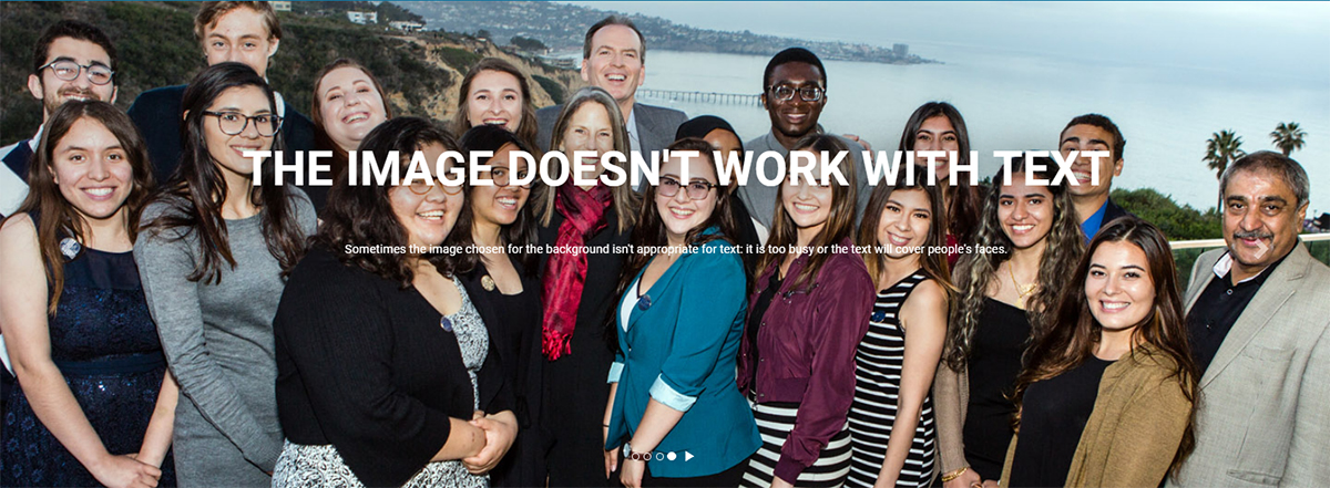
- Avoid images of people where the text will obscure faces.
- Avoid images that don't contrast with the text.
- Image Description (Alt Text)
- Describe the image for users that can't see them (images disabled/ didn't load, using a screen reader, etc.)
- Apply style modification? Choose one:
- None
- Text Color: Light or Dark
- Text Box: Choose color and opacity: Dark Blue or Light Blue, Opaque or Semi-transparent
- Gradient: Select Yes to apply a blue gradient over the image
- Background Image Use the file chooser to select your image
- Default (pre-canned backgrounds)
- Slide Background Choose one:
- Navy with Light Text
- Yellow with Dark Text (choose a different button color below)
- Blue Orb with Light Text
- Slide Background Choose one:
- Image (upload your own)
- Headline alignment Choose Left or Centered
- Headline (sentence case, white unless dark text is selected):
- Use for the most prominent information on your page (department name, etc.)
- Headline Break select 'Yes' to force part of the headline to start on a new line. Not available for centered headlines
- Blurb (smaller sentence case, white unless dark text is selected):
- Do not use for critical information. Will be omitted on smaller screens.
- Button (all caps):
- Use short, descriptive text.
- Note: Required for link.
- Color options (available only for default/ pre-canned slide type): Yellow, Cyan, Orange, Gold
- Link Type
- Internal or External
Options
- Text can be left or center aligned. Left aligned text can have a headline break (a second, indented line with same-sized text).
- Style Modifications (you can only choose one of these options if you are using your own image):
- Text can be dark instead of light (slide 5 on this page)
- Add a text box to offset your text from the image (slide 6 on this page)
- Add a gradient to offset your text from the image (slide 7 on this page)
- Text can be dark instead of light (slide 5 on this page)
- Text fields are optional. You can leave out text to let your image speak for itself.
- Add multiple images to create a rotator.
- If you don't have an image, see the hero image library or use one of our three pre-canned styles:
- Blue Orb with Light Text (slide 2 on this page)
- Yellow with Dark Text (slide 3 on this page)
- Navy with Light Text (slide 4 on this page)
- Pre-canned styles can have a yellow, cyan, orange, or gold button.
What not to do
Text problems:
- Too much text can run too far down the image, rendering your message less effective. You want to use maybe 30 words to concisely get your image across.
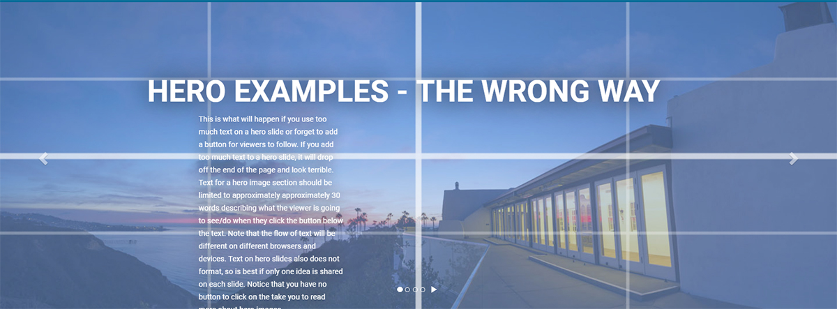
Image problems:
- People's faces are covered by text.
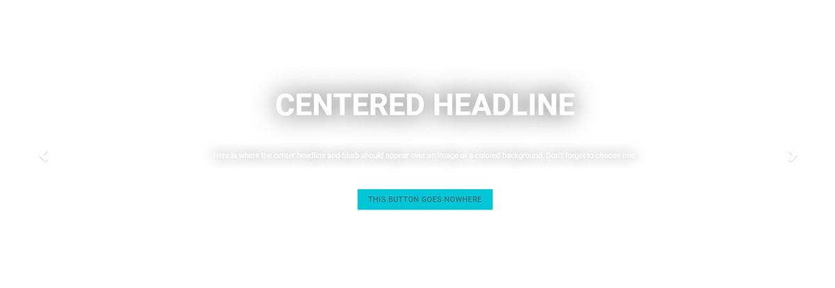
- White background doesn't provide contrast.
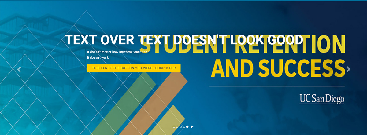
- Having text on the image conflicts with the module's floating text.
For better images, see the hero image library.