Call to Action Module
Best Practices
- The call to action module is designed to feature a single idea and link users to more information. It is not designed to contain dense information.
- Use the call to action module with a short, attention-grabbing headline and image.
- Give the user a bit more detail in the blurb, but save the in-depth information for the page you link to.
- If you have multiple modules with button links on the same page, avoid repeating the link text ("learn more," etc.). See example link text.
- Choose an appropriately sized image. See the call to action image library.
To create a new call to action module:
- From the New Content menu, click Modules->Call to Action. The module will be placed in the _modules folder by default. You can create multiple sub-folders within _modules as needed (similar to images and files). To create multiple instances of this module, copy the module and rename it. Edit each module separately.
- Click Edit to bring up the edit screen.
- Complete these fields:
- Headline:
- New: all caps is not enforced in the headline
- Formatted as heading 2
- Approximately 25 characters per line
- Maximum two lines
- Blurb (WYSIWYG):
- Brief is better. Approximately 100 words = 8-9 lines.
- Keep it simple: While a WYSIWYG is available, don't over format this.
- Button Text (All caps link text in a yellow box):
- Use as a call to action (CTA)
- Maximum 30 characters
- Link Type: Choose internal or external
- Internal/ External Link: Select your internal link or enter your external link
- Media Type: Select one:
- Image to upload an image
- 550 x 370 pixels
- See the call to action image library for pre-cropped images
- Image Description (Alt Text): Describe the image for users that can't see them (images disabled/ didn't load, using a screen reader, etc.)
- Image Overlay Type: Choose none, overlay 1 or overlay 2 (see examples below)
- Grit Yellow to use the yellow grit background (example 4, below). This replaces the former yellow trident option. Note that Style and Media Position are not available for this option
- Grit Circles to use the grit circles background (example 5, below). Note that Style and Media Position are not available for this option
- Video Embed to paste an embed code. Responsive embeds are supported for YouTube and Vimeo only
If you are using the video option, see Video Embed Instructions (especially steps 6 and 7) for guidance on how to optimize your video. - WYSIWYG (Legacy): Previously used to enter video embed code. Do not create new modules using this. Videos should be changed to a Video Embed option to fix an issue with window size
- Image to upload an image
- Style: Choose 'Light' for the default, white background and 'Dark' for a sand background
- Media Position: Choose Left or right
- Headline:
See how to add a module to your page.
Examples

1) CTA: Left Image Dark Style
Image overlay: None
HEADLINE: Approx 25 characters per line, 2 line max.
WYSIWYG: Approximately 100 words = 8-9 lines max. Keep formatting simple.
BUTTON: link with call to action (CTA) all caps statement (e.g., MEET THE STAFF).
Beside IMAGE: Image size: 550 x 370 pixels.
4) CTA: Grit Yellow background
HEADLINE: Approx 25 characters per line, 2 line max. WYSIWYG: Approximately 100 words = 8-9 lines max. Keep formatting simple. BUTTON: link with call to action (CTA) all caps statement (e.g., MEET THE STAFF). IMAGE: No image. Background design is Media Design: Grit Yellow.
5) CTA: Grit Circles background
HEADLINE: Approx 25 characters per line, 2 line max. WYSIWYG: Approximately 100 words = 8-9 lines max. Keep formatting simple. BUTTON: link with call to action (CTA) all caps statement (e.g., MEET THE STAFF). IMAGE: No image. Background design is Media Type: Grit Circles.
6) CTA: Video Embed
HEADLINE: Approx 25 characters per line, 2 line max. WYSIWYG: Approximately 100 words = 8-9 lines max. Keep formatting simple. BUTTON: link with call to action (CTA) all caps statement (e.g., MEET THE STAFF).
What not to do
Text problems:
There is too much text in this module.
- The headline and blurb is too long. The module is stretched vertically. This is particularly noticeable with the dark style.
- The button text is too long. This much text in all caps is difficult to read.

What Not to Do: Put Too Much Text in the Headline, Blurb, or Button
HEADLINE: Approx 25 characters per line, 2 line max. SINGLE TEXT AREA: Approximately 100 words = 8-9 lines max. Text does not break into paragraphs. BUTTON: link with call to action (CTA) all caps statement (e.g., MEET THE STAFF). Beside IMAGE: Image size: 550 x 370 pixels. HEADLINE: Approx 25 characters per line, 2 line max. SINGLE TEXT AREA: Approximately 100 words = 8-9 lines max. Text does not break into paragraphs. BUTTON: link with call to action (CTA) all caps statement (e.g., MEET THE STAFF). Beside IMAGE: Image size: 550 x 370 pixels. HEADLINE: Approx 25 characters per line, 2 line max. SINGLE TEXT AREA: Approximately 100 words = 8-9 lines max. Text does not break into paragraphs. BUTTON: link with call to action (CTA) all caps statement (e.g., MEET THE STAFF). Beside IMAGE: Image size: 550 x 370 pixels.
Learn how to insert a Call to Action module in your V5 CMS site here at UC San Diego
Image problems:
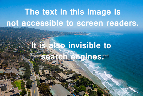
Your image should not be text-dependant.
- For text, use the headline, blurb and button.
- Text in an image is inaccessible and excluded from search.
- See the call to action image library.

What not to do: Too much text in image
Screen readers can't read text in an image. This is an ADA accessibility issue. Search engines also can't read text in an image, which can impact your search ranking.

