Examples of What Changed
Updated website features and design elements rolled out to all standard V5 CMS websites, including Blink and TritonLink. Here are examples of some of the changes you'll notice.
Overall look and feel
- New font in page titles and headings (including homepage hero captions and module headlines)
- All caps text is no longer automatically enforced for hero and module headings.
- Rounded corners added to module images, profile images, buttons, and social media icons
- Sand color replaced grey in left navigation, on profile pages, and in shaded module backgrounds
- New brand elements replaced trident and abstract library graphics in pre-canned styles, including hero and module backgrounds

Call to Action module before conversion
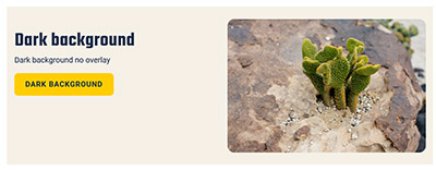
Call to Action module after conversion
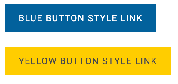
Buttons before conversion
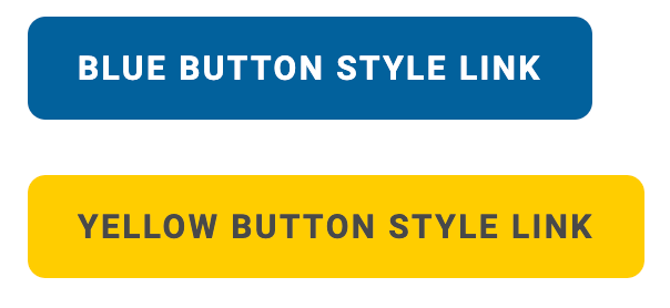
Buttons after conversion
Module updates
All modules:
- New headline font
- Headlines no longer forced to display in all-caps
- Rounded corners applied to all images and buttons
Call to action module:
- Shaded "dark style" option changed from grey to sand color
- Trident graphic background option replaced with two updated brand options


The Call to Action module with no image previously displayed a yellow trident in one corner. These modules automatically converted to a new design (shown above). You may choose to edit the module to choose an alternate design.
Call to action inset module:
- Rounded corners on floating box
- Four new pre-canned background style options
Callout content module:
- Blue text boxes (2, 3 or 4) now solid blue, instead of semi-transparent
- Rounded corners applied to blue text boxes
- Added updated pre-canned background style options
News with images module:
- Module background behind images changed from grey to sand color
- New animation effect when user hovers over each image
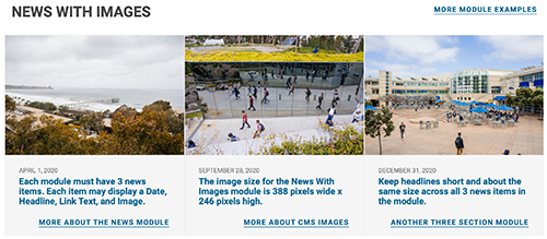

Text block module:
- Medium blue background color changed to navy blue
- Trident background graphic replaced with choice of three pre-canned options
- Added option for a background image
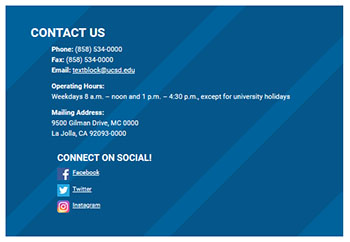
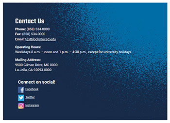
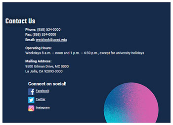
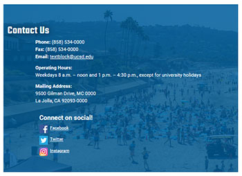
The original medium-blue Text Block module (with trident overlay, first image above) automatically converted to a navy-blue background with a blue accent in the top-right corner. You may choose to edit the module at a later date to choose one of four available designs, including a solid navy-blue background with no accent color.
Image rotator module:
- Improved slideshow controls and increased caption font size offer greater accessibility and ease of use
Other new features and enhancements
Homepage hero
- New pre-canned options replaced trident and library graphics
- No indent on blurb text under the headline
- Brand-new blue shaded text box or gradient layer may now be added underneath your hero caption
Article intro banner
- New pre-canned options replaced trident and library graphics
Drawer template pages
- Original-style blue drawers adopt the same features as light-style sand-colored drawers (increased spacing and open-and-close icons to the right of each drawer title)
Profile template pages
- Grey backgrounds changed to sand, and profile images now display rounded corners across all profile templates
Text-box shading
- Shaded backgrounds in message and call-out boxes changed from grey to sand
Updated website footer
- Links to our new campuswide privacy policy were added to our footer
Updated image library
- Precropped images with new brand graphics and colors are now available for use within all modules
Examples of outdated elements (must be removed)
Surf through your site's pages to find older trident and/or library graphics. Some of these were automatically updated on May 25, 2023, but others must be changed manually!
Don't create any new marketing items or homepage graphics with these outdated elements.


Look for graphics on your website that include trident images like these. Work toward replacing these graphics as soon as you are able.
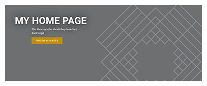

New background options are now available for the Homepage hero background and Article page intro banner. We should not be using any trident or library outline graphics; you may need to adjust these manually.
If you need help choosing graphics or have questions about the updated elements on your website, email wts@ucsd.edu.
This page was last updated on October 26, 2023.