
Hero Images
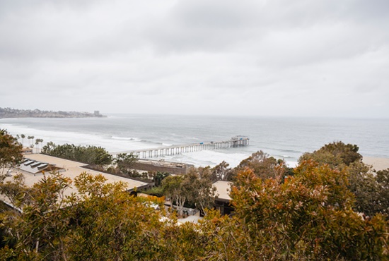
Choose a pre-canned background like this one, already built into the homepage template. Or visit the image library for a hero image that's cropped to size and ready to go. You may also resize your own image to fit into the homepage hero space.
Visit the hero image libraryWorking With Modules
This page shows an example of each of the modules available in the CMS.
The examples below have basic information about the modules, but not all modules are equally suited for conveying detailed information. Most are designed to simply direct a user to a page where they can get more details.
- Hero - One or more slides, each conveying a single idea
- Call to Action - Single idea next to an image
- Call to Action Inset - Single idea with a background image
- Callout Content - 2 to 4 related ideas over a background image or plain background
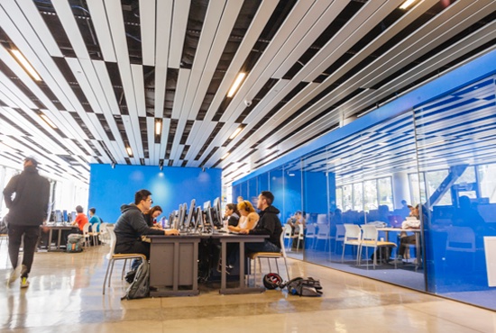
- News with Images - Exactly three ideas with individual images
- Text Block - Flexible WYSIWYG over dark-blue background (or over a medium-blue photo background)
- Tiles with Links - A grid of large button links with multiple color and background options
Example modules:
The first link in each module provides best practices, additional examples, and instructions for that module.
Call to Action
Features a 550 x 370 pixel image that can be on the right or left. Background can be light (white) or dark (sand-colored, like this one). Choose one of two optional designs to be overlaid onto the image. If you don't have an image, you can choose a plain sand-colored background with one of two graphic accents. Has one linked button.
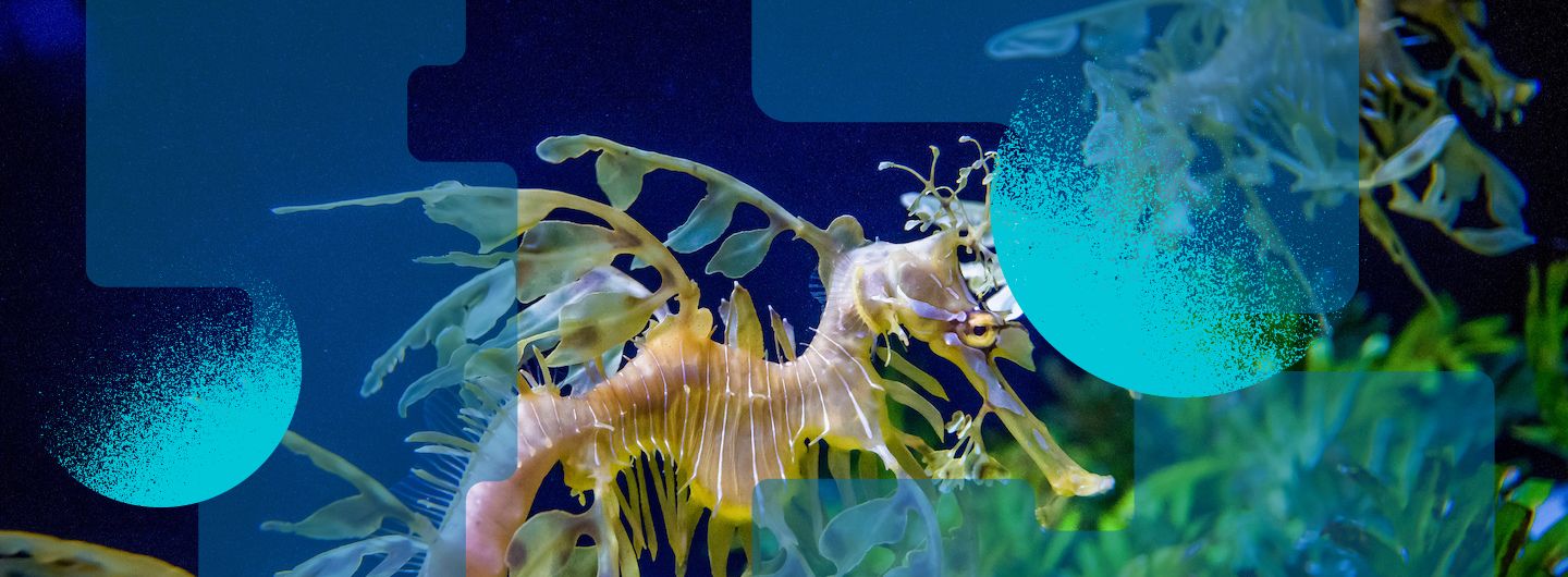
Call to Action Inset
Features a wide 1200 x 388 background image with a floating (inset) text box. There are four pre-canned background images built into the template (this is one of them), or you can upload a separate image. Text box can be aligned right or left.
Callout Content
Callout Box Headline
Features wide 1200 x 410 pixel background image with two, three, or four floating boxes and a choice of background options.
Callout Text
No formatting on text. Length should be kept fairly short and even across the boxes. Each box has separate button links.

Text Block Module
Features
Pre-styled WYSIWYG that allows for
- Text formatting (lists, headings, etc.)
- Multiple links
Choose a plain navy-blue background or a navy-blue background with one of two colorful accents. You may also upload an photograph to subtly display behind your text.
Caution
Requires care to not 'over format' the content.
Make sure your text is readable over the background that you choose.
Tiles with Links
Features text floating over tiles that can be images or solid color. Arraigned in rows of three.